The Citi logo was created in a few seconds, on a paper napkin, over a lunch meeting.
“Seconds, done in 34 years.” was Paula Schers’ answer when questioned multiple times how can an organization like Citibank base their identity on something that was done so quickly. When you hear the story of how it was created, you are inspired by the wonders of her expertise, creativity and most importantly, years of consistent practice and learning in branding.
Not trying to compare myself with the greats like Paula, but here’s my own story.
A few months back we were being briefed for a brand identity project for a new client who was launching a chain of IVF clinics.
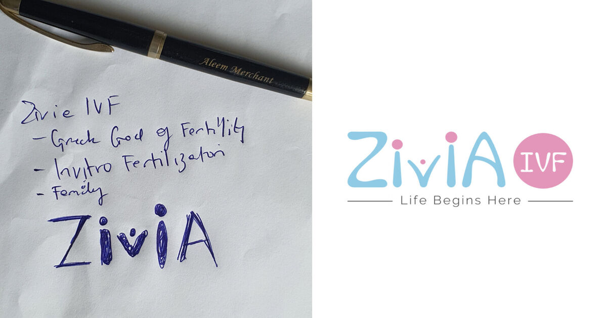
Zivia.
Zivia is the Greek God of fertility, hence the name.
This was an online call with the client team from across the country talking to us about their legacy, promise, expertise, expectations, story and the requirements.
The essential elements of the brand.
Now since I didn’t need to maintain my ‘CEOlike’ mannerisms during this online meeting (which I need to sometimes in physical meetings), I was drifting away into my creative space and ideating with myself, and pretending to be all-attentive here.
Even before the call ended, I had sketched the logo idea on a piece of paper (Yes, I know, terrible handwriting, and even more terrible sketch).
It took just a few seconds and yet it was, Simple. Relevant. Rememberable.
The next day we designed it and presented it.
It took less than 6 minutes for the entire client team to say “Yes!”
That’s what a job of a creative agency is – To crystallize, distillize and visualize the problem in a whole new light and present in the most simple form possible.


